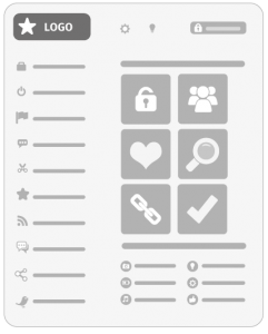
When is it appropriate to use icons in your User Interface?
We regularly design (and re-design) User Interfaces (UI) for software developers. While each project has its own quirks and nuances, there are many issues that we face time and time again. One common mistake we come across is inappropriate use of icons.
It is not unusual to see this statement included in a UI brief “… and a set of icons to help users navigate the product and enhance the experience”. One reason for this is that when people think “user interface” they think “graphical” – and icons are very obviously graphical. However, in our experience icons are sometimes used to try to jazz up a poorly thought out interface and the result can often be a confusing User Experience (UX).
When is it appropriate to use icons?

Icons are great when you want to draw attention to or differentiate particular elements of your interface. For example, you might use a series of icons to subdivide elements of key functionality by sector. The icons are intended to help the user identify each separate sector. They are also there to draw attention to the fact that this is a key area of functionality. If these icons represent each sector effectively they can be used as shorthand to save space in the interface. Avoid using icons that are too similar or ambiguous in their meaning. It is very easy for users to misread images and become lost in your product. On numerous occasions we have been tasked with redesigning interfaces where the same icon has been used for multiple functions. That really confuses users and introduces inconsistency, which is the enemy of good design.
Quality Verses Quantity
Icons also help extend the visual language of your brand, so you should be very careful how these are drawn and displayed. Consistency of style is very important. If you have collected icons from different stock libraries the chances are they will clash with each other. The resultant user experience will feel “bumpy” and lack professionalism.

Do not be tempted to create icons for every button. The eye is naturally drawn to images. If there are too many icons your user will finds it difficult to focus. The effect is that everything screams at the user and nothing gets heard. If you are already using icons to describe a section or subject, think very carefully before incorporating icons in other parts of the interface. For example, does it really help to use icons to represent basic action such as “new”, “edit” or “delete”? Often the words, consistently styled, are as powerful and communicative as graphics.
Use Recognisable Standard Icons
When you do include icons in your user interface remember to use recognisable standards. Users universally expect a magnifying glass to represent ‘Search’ and a house icon to mean ‘Home’ – so don’t try to re-invent the wheel! A graphic that is complex and open to interpretation will not make a strong icon. Icons for bespoke functions such as “create pressure point” or “build data set” rarely improve usability.
Icons within a User Interface is common, but what about using them within the content of an application? How does that effect the User Experience? With regards to UX, icons are as important to brand perception and layout as to navigation and function. Many of the same rules apply as with UI;
- don’t over do it
- keep them consistent
- ensure they are easy to read
- keep them simple.
It is quite common for icons and other small images to be used as a means of helping users read and interact with their core content. Including small icons beside sub-divisions of a page will draw attention to that area and enhance the decorative appeal of the layout. These images are quite often generic objects such as documents, pencils, laptops, calculators etc. These graphical devices provide a quick visual flag for locating specific content regions and should be implemented with rigorous consistency.
In Summary
In summary you should apply logic and good taste when using icons. There are so many free sets available that it is easy to get carried away and spray them all you’re your User Interface. But always ask yourself the question, “Does this enhance the User Experience?” If the answer is “not really”, then proceed with caution. If you are in any doubt ask a good UI designer, I’m sure there’s one around here somewhere.
Eyesparks can run a UX/UI Design workshop with your organisation, contact us to register your interest.